E.M.

Ezer Mizion System

An internal CRM system manages the annual Chinese sales setup

01

Overview

I worked on the internal CRM system for the Ezer Mizion association, which not only manages finances and projects comprehensively but also functions as the company’s internal management system.

The Main Problem

In the organization's CRM system, our focus was on refining and organizing the annual Chinese sales interface to ensure the orderly and synchronized management of funds. The main issue, highlighted by the product manager, centers on overly complex collection and distribution tables, causing user frustration. This complexity not only consumes valuable time through confusion but also results in a lack of readily available information.

02

Goals & KPIs

My goal is to improve the system for the employees of the annual Chinese sale.

  • Make the information they need available to them in an easier and clearer way
  • Add useful functions to shortcuts and dashboard
  • Filter and reorder information and actions not consumed or available

KPIs

  • Error reduction rate:

Significantly reduce user errors, indicating improved system usability and clarity.

  • Operation time efficiency:

Achieve a significant reduction in the time employees spend on operations within the CRM system, while demonstrating increased efficiency.

  • User adoption percentage:

Assessing a high percentage of users regularly adopting and utilizing new functions, shortcuts, and filtered information, indicating successful integration into their workflow.

03

Research

Following a thorough investigation into the user experience issues brought to light by the product manager, I identified several key challenges.

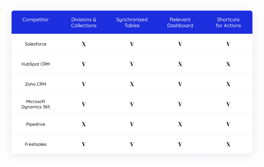
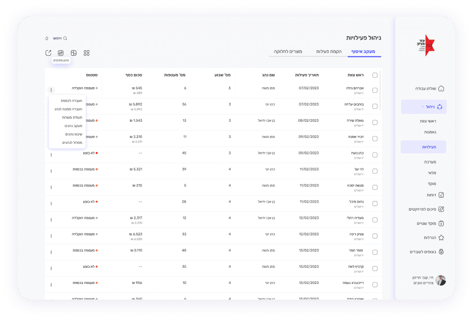
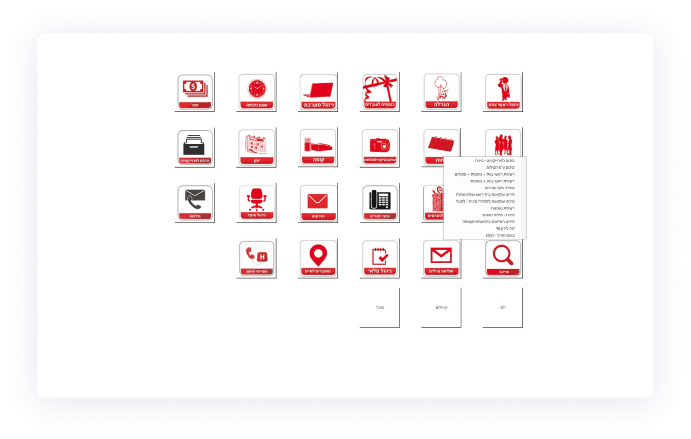
There is no additional information about the categories or the subcategories in each one – if you do not know what is where, you need to search through each category one by one each time.

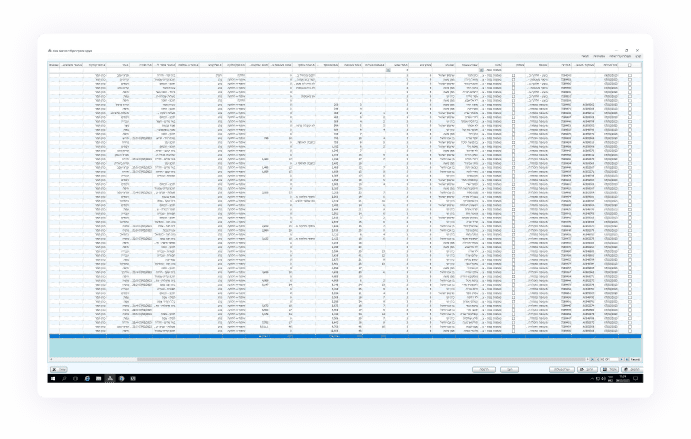
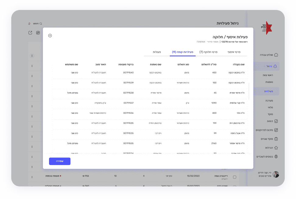
The data tables are hard to access, with a lot of unnecessary data, and are disorganized.

The main problems that arose:

The Chinese sales management interface lacks clear hierarchy and prioritization, ignoring the definition of common operations and relevant information for users compared to less significant details.

The system is flooded with information, lacking a clear organization. The information is presented without order or structure, and provides the user with unnecessary details unrelated to their current needs.

The system lacks a defined and consistent design language. For example, the use of the color red, which usually indicates a warning, is inconsistent and does not effectively highlight real problems or warnings to the user.

04

Competitors

We examined products facing parallel scenarios, assessing their primary functional actions. Through user reviews, I identified weaknesses in their existing interfaces, while also recognizing advantages that could enhance the value of my work.

05

Possible Solution

Shortcut actions are needed through the dashboard.

Main/significant data should be displayed in graphs instead of showing excess data.

A side menu should be found on all pages and navigates the entire system easily and from anywhere.

Side pane menus should be added in places where it is necessary to change/add data to the report.

06

Wireframe

First, I organized all the information intended for the system. Subsequently, I initiated the creation of two types of dashboard sketches.


Following a thorough examination and user feedback, I opted for the second design.

07

Design

The Dashboard

This should contain useful sections that are updated online according to the situation, making pertinent and necessary information accessible to the user without the need to repeatedly log into branched reports.

A Side Menu

A side menu should include all the main points of the system and gives quick and convenient access to the user from anywhere in the system.

Subcategories

A side menu opens with subcategories that help you access internal pages quickly and easily.

Date Table

Organized data table with expandable option.

Side Panel

Sidepane opens at the click of a button for adding/changing data in the table.

Pop Up

A pop-up opens - by clicking on one of the activities in the table, to view and perform actions collections and divisions. The screen is divided into tabs according to operation fields, in an orderly manner for the user.

Collection Details

The panel is divided according to different modes of activity, designed to be added and updated at different times by different users

Distribution Details

Distribution table for organized activities with changes, updates and adding products

POS activities

A pop-up opens - by clicking on one of the activities in the table, to view and perform actions collections and divisions. The screen is divided into tabs according to operation fields, in an orderly manner for the user.